Makini Bush Camp identity
Year
2019
Role
Logo design, brand identity
Deliverables
Icon, wordmark, palette, type, applications
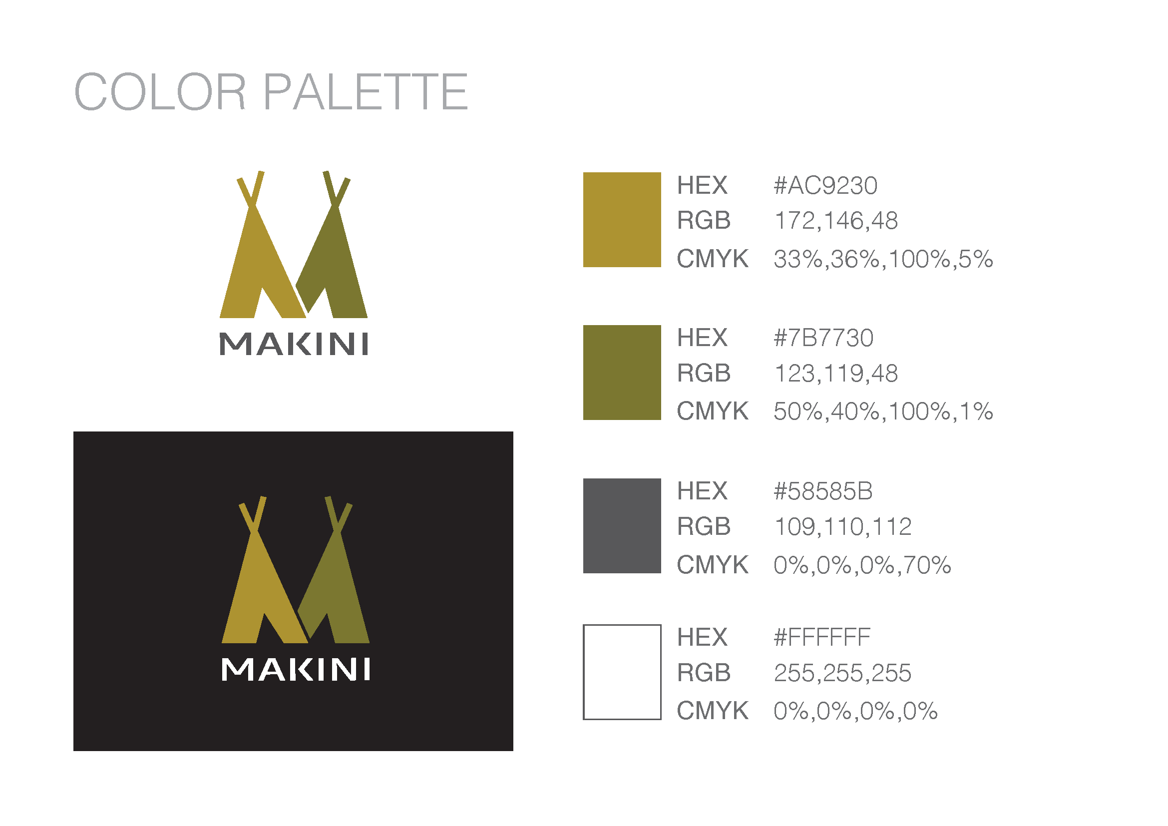
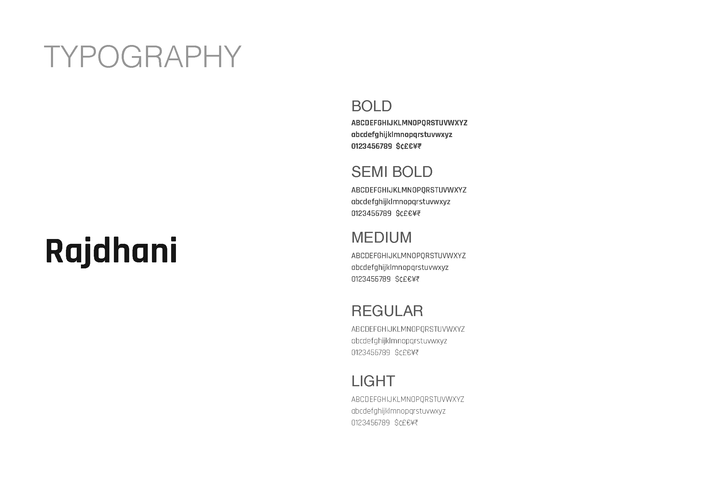
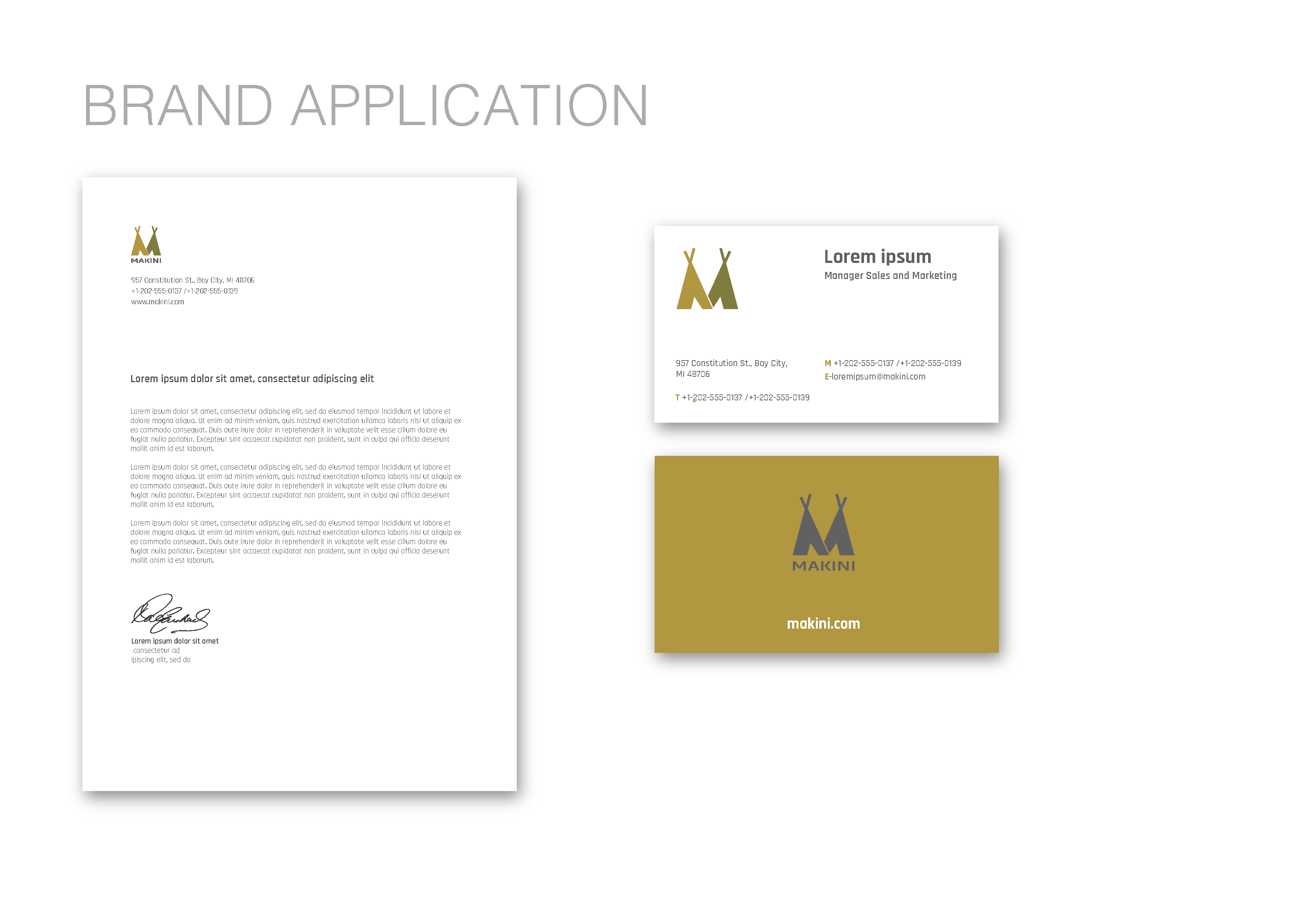
A logo and identity system for a bush camp. The mark is inspired by the camp's tents — the canvas silhouette drives the icon's geometry, which then sets the proportions for the wordmark lockup. The guidelines cover icon construction and clear space, the icon-with-wordmark lockup at four sizes, the colour palette, the Rajdhani type family across five weights, and brand applications.
Icon with wordmark
Two crossed tent silhouettes read as an M, with the poles left visible above the canvas line.